When it comes to printing Bibles, one of the most crucial factors that often gets overlooked is the font choice. As a Bible printing supplier, I've seen firsthand how the right or wrong font can make a huge difference in the readability of these sacred texts. In this blog, I'll dive into how font choice affects the readability of a Bible and why it matters.
First off, let's talk about what readability actually means. Readability refers to how easy it is for a reader to understand and process the text they're looking at. This includes factors like how quickly they can recognize letters and words, how well the text flows, and how comfortable it is to read for extended periods. When it comes to the Bible, readability is super important because people often spend a lot of time reading it, whether for personal study, religious services, or group discussions.
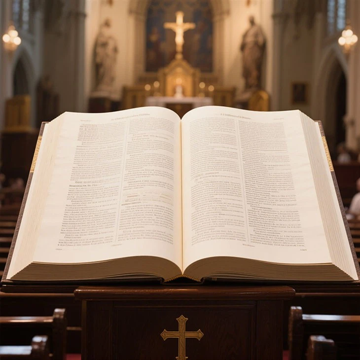
One of the key aspects of font that affects readability is the typeface. There are two main categories of typefaces: serif and sans-serif. Serif typefaces have small decorative lines at the ends of the letters, while sans-serif typefaces don't. Historically, serif typefaces have been used in printed materials like books because they're considered more traditional and easier to read in large blocks of text. The serifs help guide the eye along the line of text, making it easier to follow. For a Bible, a serif typeface like Times New Roman or Garamond can be a great choice. They're classic, familiar, and provide a sense of stability and tradition, which is fitting for a religious text.
On the other hand, sans-serif typefaces are often seen as more modern and clean. They're great for headings, titles, or short bursts of text because they stand out. However, when used for long passages of text, they can be a bit harder to read. The lack of serifs means there's less visual guidance for the eye, which can make it more tiring to read for long periods. But that doesn't mean sans-serif fonts can't be used in a Bible. They can be used strategically, like for chapter headings or to highlight important passages.
Another important factor is the size of the font. This might seem obvious, but it's amazing how often the wrong font size is chosen. A font that's too small can be incredibly difficult to read, especially for older readers or those with vision problems. In a Bible, it's important to choose a font size that's large enough to be comfortable to read, even in low - light conditions. A common font size for Bibles is around 10 - 12 points for body text. However, for large - print Bibles, the font size can go up to 14 - 16 points or even larger. If you're interested in Big Bible Print, it offers a great solution for those who need a more readable version.
The spacing between letters (kerning) and lines (leading) also plays a big role in readability. Good kerning ensures that the letters are spaced evenly, so they don't look cramped or too far apart. If the letters are too close together, it can be hard to distinguish individual characters, while if they're too far apart, the words can lose their cohesion. Leading, or line spacing, is equally important. Adequate leading makes it easier for the eye to move from one line to the next. In a Bible, where there are often long passages of text, proper leading can prevent the text from looking like a big, unreadable block.
The style of the font can also impact readability. For example, italicized or bold text can be used to emphasize certain words or passages. But if too much of the text is in italic or bold, it can become overwhelming and actually reduce readability. Italics are best used sparingly, perhaps for quotations or to highlight a particular phrase. Bold text can be used for headings or important statements, but again, moderation is key.

Color is another consideration. In most cases, black text on a white or off - white background is the most readable combination. This high - contrast combination makes it easy for the eye to distinguish the letters. However, some Bibles may use color to highlight different sections or to add a decorative element. If color is used, it's important to ensure that there's still enough contrast between the text and the background.
As a Bible printing supplier, I've worked with a variety of fonts and have seen the impact they can have on the final product. Choosing the right font isn't just about aesthetics; it's about making the Bible accessible and enjoyable to read. Whether you're a church looking to print Bibles for your congregation or an individual interested in a custom - printed Bible, the font choice can make or break the reading experience.
For those who want to add a more artistic touch to their Bibles, Bible Verse Art Print offers a unique option. These prints can use different fonts and designs to create a beautiful and meaningful piece. And if you're looking for a more luxurious option, Leather Bible Book Printing provides a high - quality, durable way to present the sacred text.
In conclusion, font choice is a critical aspect of Bible printing. It affects how easily the text can be read, which in turn impacts the overall user experience. When choosing a font for a Bible, consider the typeface, size, spacing, style, and color. By making informed decisions, you can ensure that the Bible you print is not only a religious artifact but also a pleasure to read.
If you're interested in our Bible printing services or have questions about font choices and readability, don't hesitate to reach out. We're here to help you create the perfect Bible that meets your needs. Whether it's a traditional, large - print, or artistic version, we have the expertise to make it happen.
References
- Tschichold, Jan. "The Form of the Book: Essays on the Morality of Good Design." Hyphen Press, 1991.
- Bringhurst, Robert. "The Elements of Typographic Style." Hartley & Marks, 2004.


