Packaging has never carried more strategic weight than it does right now. Consumer expectations have shifted, sustainability requirements are tightening, and the unboxing moment - once a physical event between a customer and a product - now plays out in front of thousands of people on social media. The decisions brands make about materials, finishes, and structure have consequences well beyond the shelf.
Working with brands across cosmetics, food, electronics, and DTC, we've watched these pressures converge into a set of clear, consistent trends for 2026. Some are driven by regulation. Others by changing consumer behavior. A few by technology that simply wasn't ready until now. This guide covers the ones that actually matter - and what to do about them.

Sustainable Packaging Has Caught Up With Luxury Aesthetics
For a long time, choosing sustainable packaging meant accepting a visual step down. Recycled materials came with limitations - rougher textures, fewer finish options, a look that signaled "responsible" but not "premium." That constraint has largely disappeared.
Molded fiber is the clearest example. Once associated with egg cartons and takeaway coffee lids, it now appears in precisely engineered formats for cosmetic packaging, electronics, and specialty food - often with finishes that rival injection-molded plastic. Mono-material structures, made from a single material type for genuine recyclability, have benefited from advances in barrier coatings that maintain moisture and grease resistance without laminates that contaminate recycling streams.
Refillable packaging systems are accelerating alongside these material developments. Premium brands in beauty and personal care are investing in durable outer containers paired with pouches or cartridges for the refill. The customer keeps the premium packaging; only the consumable part is replaced. This model reduces material use per product cycle while also building a recurring relationship with the customer - an unusual case where sustainability and retention strategy align cleanly.
One shift worth noting: consumers have become considerably more skeptical of vague green claims. "Eco-friendly" without specifics now draws scrutiny rather than goodwill. Brands that back their sustainability messaging with verifiable certifications, documented sourcing, and clear end-of-life instructions on the packaging itself are the ones building trust. Those that don't are finding the backlash arrives faster than the benefit.

Digital Product Passports: Compliance You Can Turn Into Engagement
The QR code on your packaging is becoming significantly more important. The European Union's Sustainable Products Regulation requires Digital Product Passports (DPPs) for a growing range of product categories - a shift that is reshaping how brands think about the information layer their packaging carries.
A DPP is a digital record linked to a physical product, typically accessed by scanning a QR code or NFC tag. It can contain material and sourcing information, manufacturing details, authentication verification against counterfeits, ownership history for resale markets, and recycling guidance. For luxury categories especially, this technology addresses a persistent problem: proving authenticity in a market where high-quality fakes are common.
The brands gaining the most from DPPs aren't treating them as a compliance checkbox. The digital layer creates a direct, post-purchase connection between brand and customer. That QR code can lead to a dedicated product page with care instructions, an invitation to a loyalty program, early access to the next collection, or augmented reality content. A regulatory requirement becomes a touchpoint that most brands didn't previously have access to.
If DPPs aren't yet mandatory in your market or product category, this is a useful window to build the infrastructure without a deadline creating pressure. Brands that pilot early tend to have cleaner implementations than those building in a rush.
Quiet Luxury: When Restraint Is the Premium Signal
The visual language of premium packaging is in the middle of a significant shift. Loud logos, high-gloss surfaces, and mirror metallics are giving way to something more measured - and in many categories, more effective.
Quiet luxury packaging works through restraint on the surface and investment in the tactile. Champagne gold replaces brash yellow-gold. Ivory and warm off-whites replace stark white. Brand marks shrink or move to secondary positions. Typography becomes cleaner, with generous spacing. The visual effect is understated confidence rather than visible effort.
The real budget goes into what the hand notices rather than the eye. Soft-touch lamination that genuinely feels like velvet. Debossing that catches light at an angle. Ribbon pulls with actual weight to them. Spot UV varnish creating subtle dimension on a matte base. These are the elements that communicate quality when the box is picked up - before the product inside is even visible.
The practical mistake brands make when attempting this aesthetic is cutting material quality alongside visual complexity. Quiet luxury requires more investment in paper stock, finishes, and construction - not less. A sparse design on thin board doesn't read as refined. It reads as cheap. The restraint on the page has to be supported by quality in the hand.
For brands working on custom rigid boxes or premium folding cartons, this is also a good moment to reconsider finish combinations: a matte laminate base with selective soft-touch coating and a single foil-stamped element often lands better than more elaborate decoration.

Heritage Design: Craft Signals in an AI-Saturated Environment
When algorithmically generated imagery is everywhere, packaging that shows clear evidence of human creative work carries a different kind of authority. This is driving a sustained trend toward what's broadly called heritage aesthetics: hand-drawn botanical illustration, engraving-style linework, classical typography, vintage label structures borrowed from apothecary jars and heritage spirits.
The underlying logic is straightforward. These design elements communicate that a person made deliberate choices at every point - that someone with taste and skill created something intentionally. That signal is difficult to replicate at scale, which is precisely what makes it valuable.
The risk is doing it badly. A full recreation of a Victorian label reads as costume rather than character. The more effective approach uses heritage elements as accents within a contemporary structure: a hand-drawn botanical illustration paired with modern type, an engraved monogram on an otherwise clean surface, a vintage-inspired label on an unexpected color. Uncoated or textured paper stocks amplify the hand-rendered quality; the same illustration printed on coated gloss loses most of its effect.
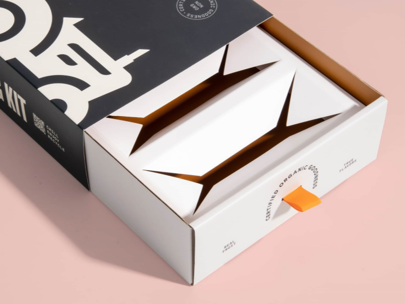
Multi-Sensory Unboxing: Designing Beyond the Visual
Premium packaging that only addresses sight is leaving brand value unrealized. The most memorable unboxing experiences - the ones that get filmed and shared - are designed as sequences engaging multiple senses.
Touch is where the most consistent value is built. The weight of the outer box before it's opened. The texture under a finger. The resistance of a magnetic closure as it seats. Whether a ribbon pull feels substantial or flimsy. These micro-experiences communicate quality in a way that bypasses rational evaluation entirely.
Sound has become a deliberate design variable. The soft click of a well-engineered magnetic closure. The structured sound of a rigid box lid seating correctly. The whisper of tissue paper. A box that collapses or crinkles at first contact undermines the premium impression before the product is visible. Our magnetic closure rigid boxes are specifically engineered for that closing sound and resistance - it's not accidental.
Sequence matters as much as any individual element. The order of reveals - outer sleeve to inner box to tissue to product - is a narrative structure. Each layer should build anticipation rather than simply contain the next one.
The business case for this investment: unboxing content is organic endorsement. When packaging creates a genuine reveal moment, customers document it. That user-generated content reaches audiences that paid advertising doesn't, and it carries the credibility that comes from an unsolicited recommendation. Designing for the camera isn't cynical - it's recognizing that the packaging experience now extends beyond the person receiving it.
Personalization at Scale: Variable Printing and AI Design Tools
Personalized packaging used to require either a very large print run or a very large budget. Neither constraint applies in the same way anymore.
Variable data printing (VDP) allows individual units within a single digital print run to carry unique content: customer names, numbered limited editions, region-specific copy, retailer-exclusive designs, or entirely different artwork. The setup costs that once made short runs of custom packaging prohibitive have dropped substantially. A brand can now produce 500 units with individual recipient names, or ten retailer variants in a single order, without the economics forcing a choice between personalization and margin.
AI design tools are accelerating iteration on top of this. Brands can now generate and test multiple colorways, layout options, or illustration style variations at speed that wasn't previously viable outside large agencies. This is genuinely useful for seasonal editions, regional adaptations, and limited runs - areas where the design overhead previously made customization impractical.
One practical note: VDP requires digital printing rather than traditional offset, and files need to be set up to accommodate variable fields from the start. If personalization is a goal, it's worth discussing with your printer at the brief stage rather than retrofitting it later. See our overview of print methods for custom boxes for a breakdown of which technologies support variable content.
Carbon Labels: Getting Ahead of Transparency Requirements
A carbon label states the greenhouse gas emissions associated with a product's lifecycle - from raw materials through manufacturing, transport, use, and disposal - expressed as a CO₂ equivalent figure and printed directly on the packaging. The model is analogous to nutritional labeling: giving consumers the information to make informed comparisons.
The mechanism behind carbon labeling is a lifecycle assessment (LCA) - a structured evaluation of environmental impact across all stages of a product's existence. LCAs have historically been expensive and technically demanding, but tools for conducting them at smaller scale have become considerably more accessible. Third-party certification bodies, including the Carbon Trust, offer certification that can be cited on packaging with verified credibility.
Carbon labels are currently voluntary in most markets, but the direction of travel - particularly in the EU, where anti-greenwashing regulation is tightening alongside sustainability disclosure requirements - points toward mandatory disclosure for certain categories in the medium term. Brands that build the data infrastructure now, and begin communicating their footprint proactively, are better positioned than those building under regulatory pressure later. Your packaging supplier should be able to provide material-level data as a starting point for an LCA.

Structural and Geometric Packaging: Form as Brand Differentiation
While quiet luxury invests in surface restraint, a parallel trend uses three-dimensional form itself as the primary design statement. Geometric packaging - clean angles, unexpected proportions, sculptural profiles - creates brand recognition that doesn't depend on graphic design. A distinctive silhouette is immediately identifiable on a retail shelf and in a social media image. It's also harder to copy than a printed pattern.
This approach works particularly well for fragrance, beauty accessories, spirits, and specialty food - categories where the packaging has shelf presence and the product itself is compact enough that the box becomes the visual anchor. Structurally distinctive packaging also carries an efficiency argument: simple, optimized geometric forms often use material more effectively, which aligns with sustainability goals and can reduce per-unit material cost.
The engineering consideration that's easy to underestimate: a structure that photographs well in a retail context may need significant work before it's ready for e-commerce transit. Corner integrity, surface susceptibility to scuffing, and fit within standard shipping carton dimensions all need testing. Custom folding box structures designed for both retail display and direct-to-consumer shipping require dieline planning from the start - retrofitting a retail-optimized structure for fulfillment is consistently more expensive than designing for both contexts upfront.
E-Commerce Packaging: The Brief Is Different From Retail
The fastest-growing packaging challenge we work through with clients isn't retail - it's getting a premium experience to a customer's door without a store environment to support it. These are genuinely different briefs, and applying retail packaging logic to direct-to-consumer shipping is one of the most common and costly mistakes we see.
Retail packaging competes on a shelf, is handled by trained store staff, and travels home in a bag. DTC packaging needs to survive a fulfillment warehouse, a courier network, and potentially weeks of transit - and then create a premium impression the moment the outer box is opened at a front door. The outer layer has to protect the premium inner layer. The inner layer has to create the experience.
In practice, this means treating the shipping container and the product packaging as two distinct design problems. Custom printed corrugated boxes for the outer layer keep the brand visible in transit while protecting what's inside. The interior packaging -
custom printed gift boxes, tissue, branded inserts - does the experiential work at the moment of opening.
Right-sizing matters more than brands typically account for. A box that fits the product without excessive void fill signals competence and reduces the visual impression of waste. Oversized boxes filled with packing material communicate the opposite of intentional premium packaging, regardless of how well-designed the inner box is. Many DTC brands are still shipping premium products in generic outer packaging - the bar for standing out here is relatively low, and the investment is modest compared to the perception gap it closes.
How to Prioritize: A Practical Framework Before You Commit
Nine trends is more than any brand can address in a single packaging project. The question is which ones are worth your attention first.
Start with your current gaps, not the trend list. If customers are already commenting on your packaging's environmental credentials, that's a clearer signal than a trend report. If your unboxing content is generating zero organic social sharing, that points to a different priority. Trends that solve problems you already have return value faster than trends pursued because they're directionally correct.
Know your customer segment before choosing an aesthetic direction. Quiet luxury resonates strongly in premium skincare, spirits, and jewelry. It's less relevant in children's products or functional food. Carbon labels matter considerably more to younger adult buyers and sustainability-aware consumers than to other segments. Geometric structural innovation has different implications for a brand selling through boutique retail versus one selling exclusively through its own website.
Plan for your production timeline honestly. Structural packaging changes and new material sourcing typically take months, not weeks, when working with a supplier who does this properly. Digital and variable printing changes can move faster. If you have a seasonal launch window, work backward from it to understand which changes are actually achievable. The brands that get this right almost always start conversations with their printer earlier than feels necessary. Review how packaging costs are structured before finalizing your scope - material and structural choices made early have the most leverage on final cost.
If you're planning a packaging update for 2026, reach out to our team at XW Print. We work through material selection, structural design, finish options, and production timelines - and we'd rather be involved at the brief stage than called in to solve problems that were set in motion months earlier.
FAQ
Q: What are the most important packaging design trends for 2026?
A: The trends with the broadest impact are sustainable materials that match premium aesthetics, Digital Product Passports driven by EU regulation, quiet luxury aesthetics emphasizing tactile over visual, multi-sensory unboxing experiences, and e-commerce-specific packaging design. Personalization through variable data printing and carbon transparency labeling are significant for brands in relevant categories. Most effective packaging strategies in 2026 address several of these simultaneously rather than treating them as separate initiatives.
Q: What is a Digital Product Passport and does my brand need one?
A: A Digital Product Passport is a digital record linked to a physical product - typically accessed by scanning a QR code - containing information about materials, sourcing, authenticity, and end-of-life guidance. The EU's Sustainable Products Regulation is mandating DPPs across product categories on a rolling timeline. If you sell into European markets, the relevant question is which timeline applies to your specific category. If you don't, DPPs still offer brand value in anti-counterfeiting, customer engagement, and post-purchase communication.
Q: Does sustainable packaging have to look different from conventional packaging?
A: No - and this is the significant change of the past few years. Molded fiber, mono-material structures, and recycled paperboards now accept the same premium finishes - soft-touch lamination, spot UV, foil stamping, debossing - as conventional materials. The visual result is indistinguishable from non-sustainable alternatives in most applications. The constraint used to be real; it largely isn't anymore. The remaining consideration is structural: some sustainable materials have different rigidity or moisture resistance properties that affect how they're engineered.
Q: What does "quiet luxury" packaging actually mean in practice?
A: Quiet luxury packaging reduces visual noise - smaller brand marks, restrained color palettes, clean typography - while increasing investment in tactile quality. The signal of premium shifts from what the eye sees to what the hand feels: the weight of the paper, the texture of a soft-touch coating, the resistance of a magnetic closure, the sound of a well-made lid seating. It requires more investment in materials and construction, not less. A sparse design on thin stock reads as cheap rather than refined.
Q: How far ahead should I start planning a packaging change?
A: Structural changes and new material sourcing typically require three to six months from brief to production-ready samples, depending on complexity. Finish changes on an existing structure can move faster. Variable data printing and digital personalization have shorter lead times than offset-printed projects. As a practical rule: if you have a firm launch date, add two months to whatever timeline your supplier quotes and start from there. Packaging projects almost always surface unexpected decisions - material availability, structural engineering adjustments, regulatory requirements - that compress faster than the production process itself.


